iRobot | Website Design Updates

The Client
iRobot is a technology company focused on designing consumer robots for inside and outside the home, including a range of autonomous home vacuum cleaners (Roomba), floor moppers (Braava), and other household cleaning robots.
The Brief
In preparing for the launch of a new product lineup, iRobot wanted to create a seamless marketing plan that covered everything from the overall strategic and creative approach, a media strategy, a public relations plan, and the online digital experience strategy.
For the digital experience, the goal was to make any updates to the existing iRobot website that would help drive awareness, consideration and conversion for the new robot vacuum cleaning models.
Audience
New and existing customers.
Solution
The holistic marketing plan was an inter-agency effort, where our agency’s task was to create the strategy for the online digital experience. Our solution encompassed making design updates to key pages of the iRobot website in order to streamline a customer’s path to purchase. Pages that were completely redesigned include:
Homepage
Learn / About Roomba page
Product Detail pages
Client:
iRobot
Business Model:
B2C
Team:
• Strategy – Jessamyn Wallace & Brendon Buckley
• UX – Jess Chow, Julie Michaud
• Visual Design – Tim Dwyer
• Creative Direction – Steve Yaffe
• Copy – Doug Murphy
• Front-end Dev – Meghan Callahan
• Back-end (Sitecore) Dev – Tim Dufour
• Production – Katie McCarthy
• Account – Joanna Field, Dakota Rabbitt
UX Deliverables:
• Customer Journey Mapping
• Strategic Recommendations
• Content Strategy
• Wireflows
• Usability Testing
• Wireframes
• Functional Specification
The Design Process
Persona - The Advocate
Approach
To determine what changes are needed on the site to feature the new product launches, we needed to gain an in-depth understanding of the current customers’ online path to purchase. Digging into iRobot’s existing path to purchase research as well as existing site analytics, the team strategist and I created personas to shed light on user behaviors, and mapped out each persona’s customer journey to uncover the pages or types of content users would be looking for during their purchase journey.
In addition, we also performed a competitive & aspirational audit. Looking at how competitors and aspirational companies approach new product launches can unveil best practices or opportunities where iRobot can shine.
Strategic Recommendations
Based on our research, the team recommended:
An improved homepage, learn (about Roomba) page, and product detail page to streamline the path to purchase, make it easier for users to decide on an appropriate iRobot product, and provide clear targets for media.
Updates to the store homepage and store category landing pages for a comprehensive experience.
A redesigned navigation structure to improve user flows and to create the most seamless customer site experience.
Blending brand storytelling and product feature information to serve multiple personas and points in the journey at once, and deliver a more useful and enjoyable experience for every new, old, and potential customer.
For phase 1, iRobot and our team decided to pursue recommendation #1 and #4 to meet new product launch deadlines.
Template Objectives Example
Template Messaging Hierarchy (Content Strategy) - About Roomba
Wireflows
In addition to the customer journey map, the team needed to think through an additional teaser experience for a soft pre-launch announcement. To ensure that we were thinking through the entire journey, I created additional wireflows for this teaser experience - which outlined that once the pre-launch announcement was released, the homepage hero area would be replaced with this announcement, where the user could sign up to stay informed.
Template Objectives & Content Strategy
Further defining the experience, I outlined template objectives for the key pages that would be redesigned. To make sure that each template walked the balance of telling the brand story and highlighting product features, I created a content strategy for each - through messaging prioritization and key functionality/purpose definition of each component on a given page.
Wireframe - Homepage
Interactive Wireframe Prototype
Working extremely closely with the visual designer, copywriter and developers on my team, I created a responsive interactive wireframe prototype that included: the current homepage with the soft pre-launch teaser, our recommended homepage post-launch, a new About Roomba page, an iRobot Innovations page, and revamped product detail pages.
Functional Specification
To hand off to the development team, I put together functional specifications that clearly defined the intended functionality of each element on every template.
Functional Specification for Key Pages
Functional Specification for Product Detail Pages
After visual designs were created, we conducted usability testing with prospective customers, competitive vacuum owners, and current customers. Pages that were tested include the recommended homepage, the About Roomba page and the product detail page.
Test Plan
Before testing, I put together a test plan to outline logistics, equipment/tools, the tasks and any pre/post-study questions.
Usability Testing
Usability testing was conducted with a total of 14 participants (7 on desktop designs, 7 on mobile designs). Participants’ screen, facial expressions, finger gestures (on mobile) and their responses were recorded as I walked them through each task.

Usability Testing - Desktop

Usability Testing - Mobile
Findings & Recommendations
After conducting usability tests, we analyzed participant responses and testing results, and put together a findings & recommendations document. We found that:
Users struggled with certain product terminology
Users preferred to scan and see product categories quickly
Users reacted positively to certain words regarding product functionality and pricing
Users struggled to find certain page elements
Users reacted positively to the product videos
Once these issues were uncovered, the team incorporated recommendations to solve for them, resulting in final designs and implementation of a product that has gone through iterations of feedback from both the business and actual end users.
Usability Testing Findings & Recommendations - Takeaways
Usability Testing Findings & Recommendations - Finding 2
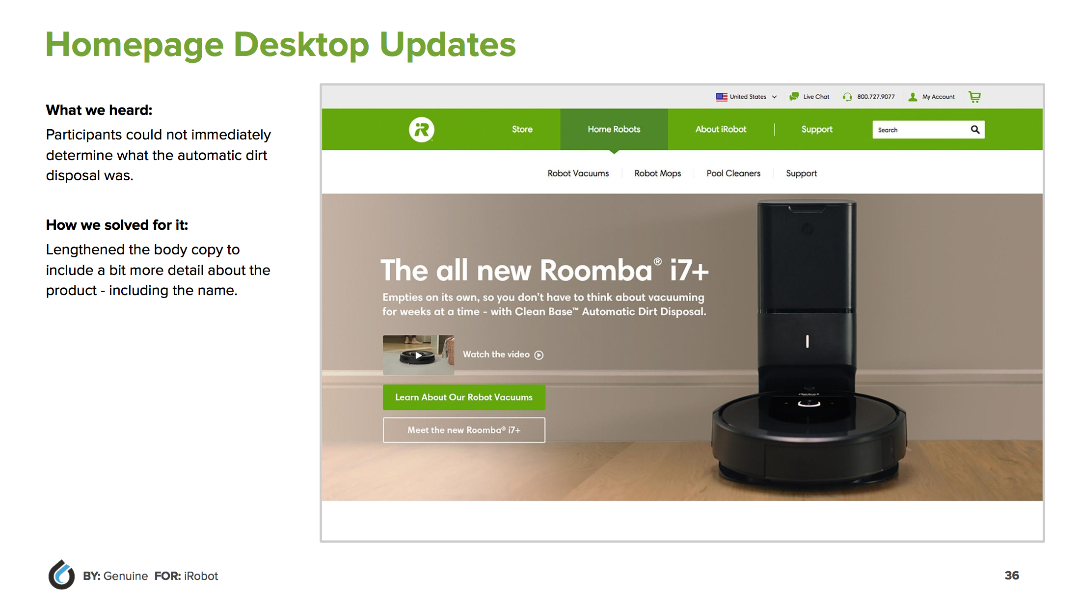
Design Updates - Homepage (Desktop)