BIC | Razor Website Redesign

The Client
BIC is a consumer products manufacturer known for making products such as disposable razors, lighters, and stationery.
The Brief
Historically, BIC Razors have marketed their men’s and women’s razors differently, from brand voice and personality to web presence. Each lived on its own site, while the e-commerce experience for all BIC products lived on another.
While it was a requirement to maintain the e-commerce site separately from the marketing sites, the client came to us for a unifying brand strategy of the razor marketing sites that ensures a seamless handoff from exploration to purchase.
Audience
New and existing customers.
Solution
Unified the men’s and women’s razor sites into one website, with clear handoff to shopbic.com at product detail pages.
A new website with new templates, content strategy and visual design.
Introduced a user-centered tagging and filtering system.
Ensured seamless handoff to BIC’s Sitecore e-commerce platform.
Client:
BIC
Business Model:
B2C
Live Website:
https://razor.shopbic.com/
Team:
• SEO – Phoebe Fasulo
• Creative Direction – Chris Pape
• Strategy – Joe Panepinto
• UX – Jess Chow
• Visual Design – Christen Dute
• Copy – Doug Murphy
• Front-end Dev – Dan Morse
• Back-end (Sitecore) Dev – Rick Cabral
• Production – Margo Romanowski
• Account – Giola Veliaj
UX Deliverables:
• Sitemap & Taxonomy
• Wireframes
The Design Process
Current Purchase Funnel
Desired Purchase Funnel
Purchase Funnel
By mapping out the current purchase funnel, we identified opportunities to increase awareness and conversion, as well as brainstormed some innovative ideas to go about doing so.
User Motivations and Jobs to be Done
The strategist and I looked at the brand’s existing research on men vs. women’s shaving motivations, and uncovered that the site needs to help elevate the perception of the BIC brand. From there, we identified jobs to be done that mapped to our users’ primary intentions based on where they are in the purchase funnel.
Experience Pillars
Site Sections
Sitemap
Site Sections & Sitemap
I then created the information architecture of the new site - clearly showing the path to men’s vs women’s razors for those users wanting to directly navigate to products, while providing easy access to other content for those in consideration such as tips, an engagement tool to ‘find the right razor for you’, and coupons & deals.
Experience Pillars
The tone of voice, differentiation, and desired interaction on the website were established through experience pillars, providing a solid foundation for the website design. I defined these through a deep dive into BIC’s brand values, brand voice, and competitive research.
Template Identification
After laying out the IA, I identified and established objectives for 9 template for the new site, so that my wireframes will clearly meet user needs and business requirements.
Template Identification Example
Wireframe - Homepage
Interactive Wireframe Prototypes
Working very closely with the visual designer and copywriter on my team, we defined and designed a total of 9 templates, in desktop and mobile.
HTML Style Guide
After my wireframes were translated into visual designs, the visual designer, front-end developer and I collaborated on creating an HTML style guide to ensure that there were guidelines for all components - where we clearly defined visual differences between primary and secondary CTAs, heading text hierarchy, form fields, etc.
Based on our work on the BIC razor website, we were tasked to reuse the components we created for the lighter and stationery sites. Because we utilized a component-based design, we were able to reuse many existing components and strategically defined new components only for content or functionality that necessitated it.
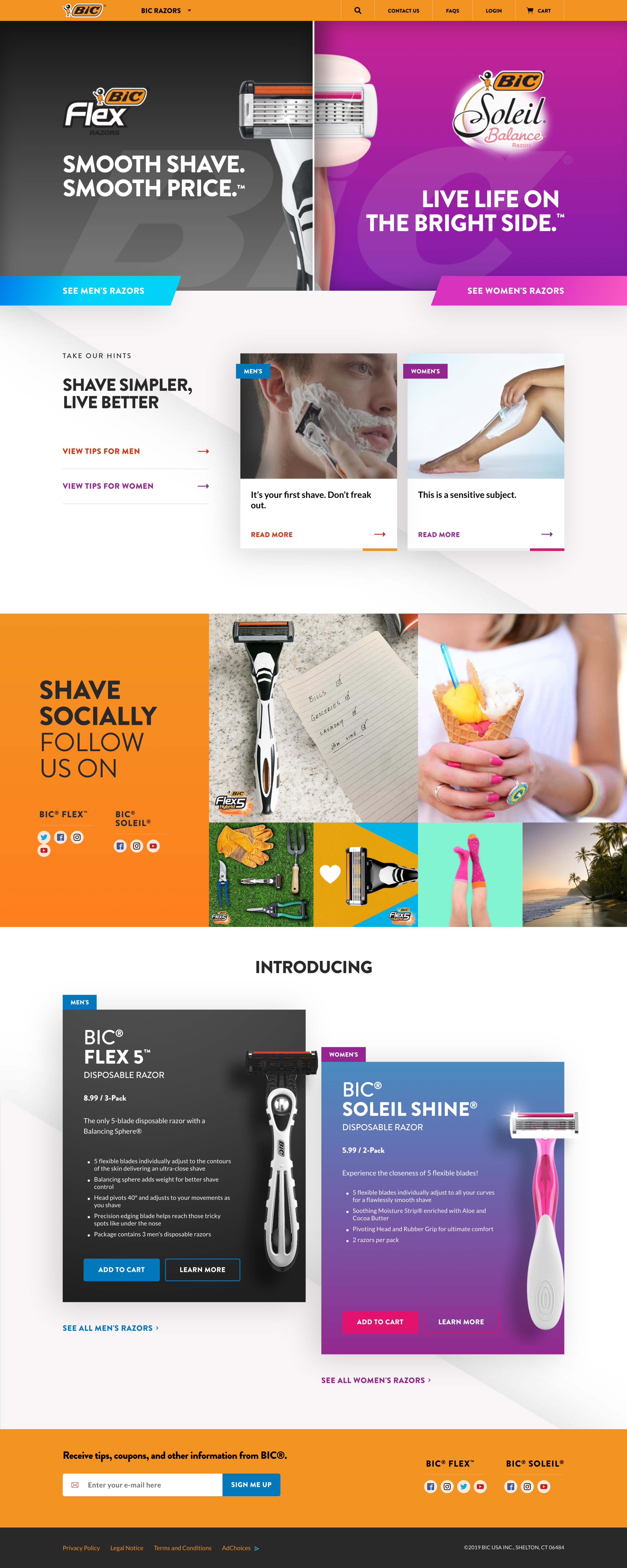
BIC Razors

BIC Lighters
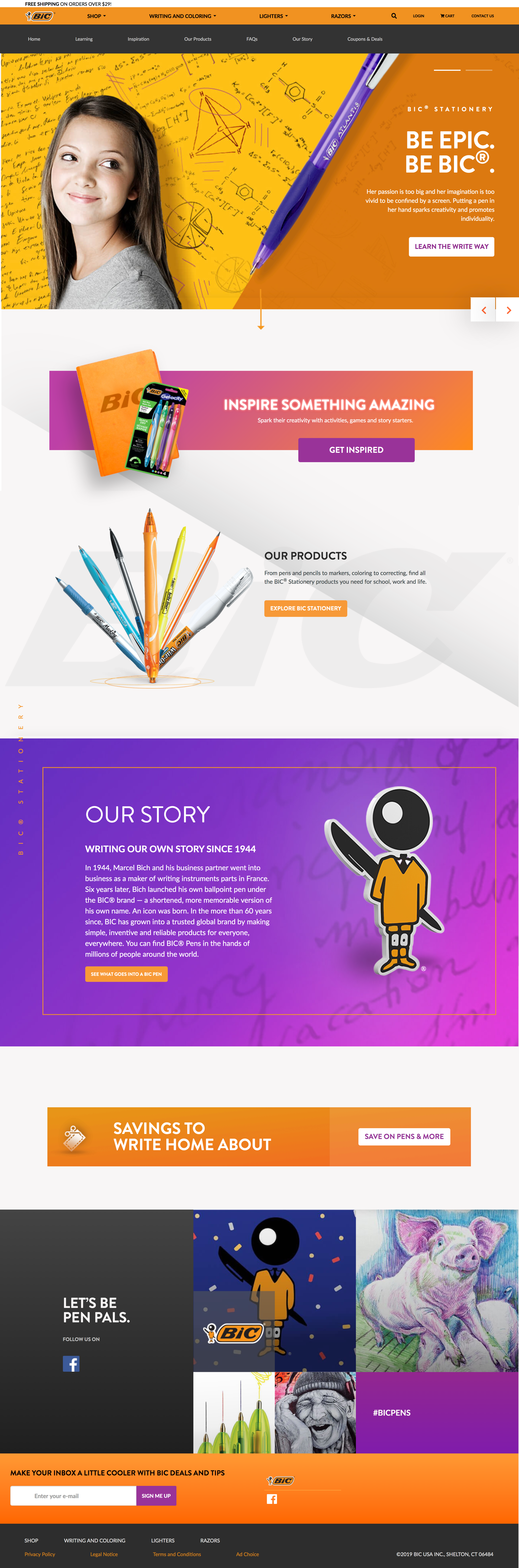
BIC Stationery